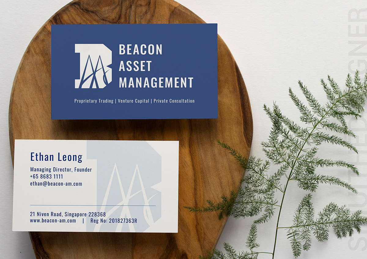
My client is really nice and very straightforward when it come to their company corporate identity. He wanted something simple and straight to the point.
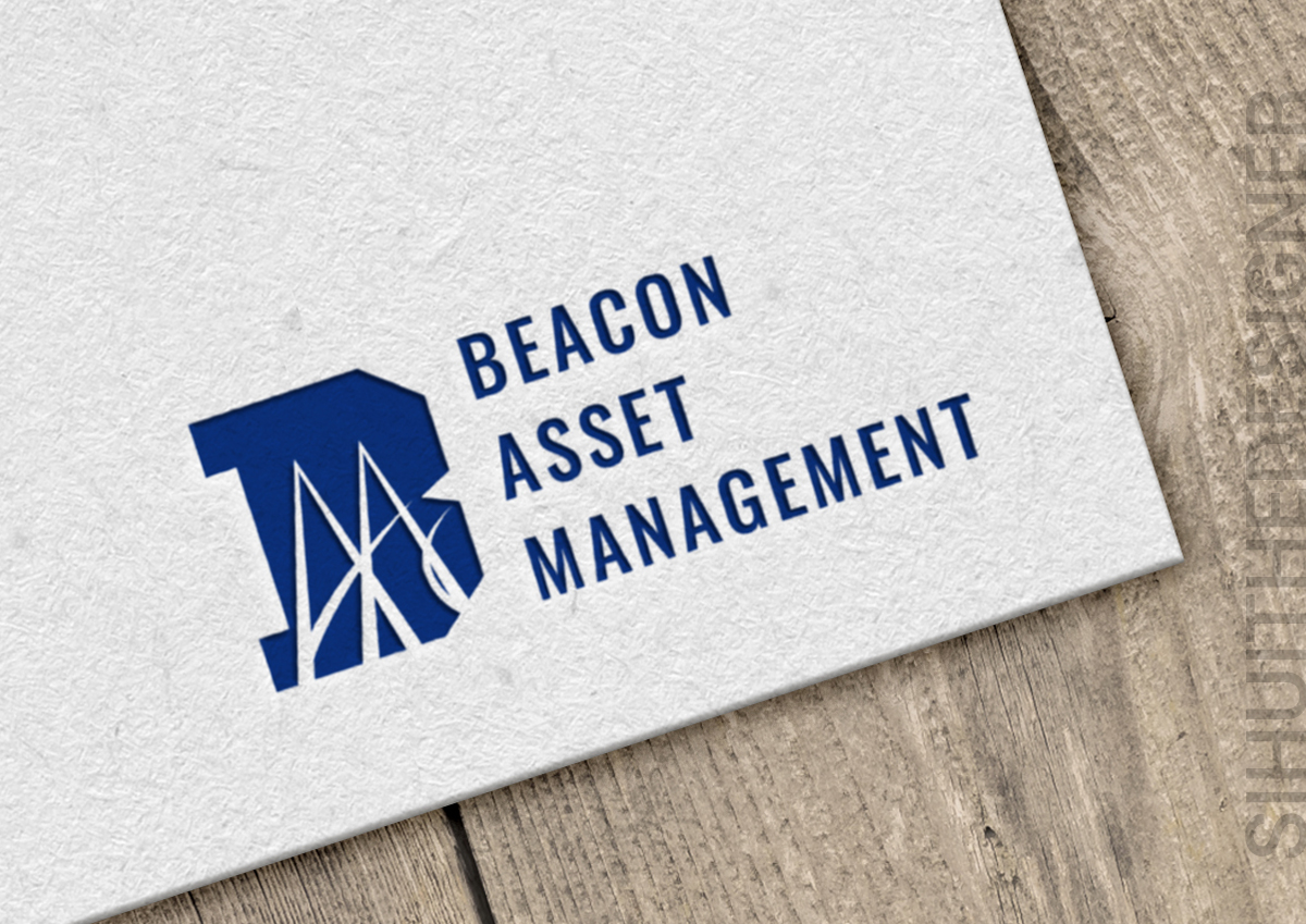
The brief is Bridge.
I did the design of creating the initial “A” to be a bridge creating the initial “M”.
